Mobile Responsiveness: Optimising Font Size, Forms, and Overall Mobile-Friendly Design
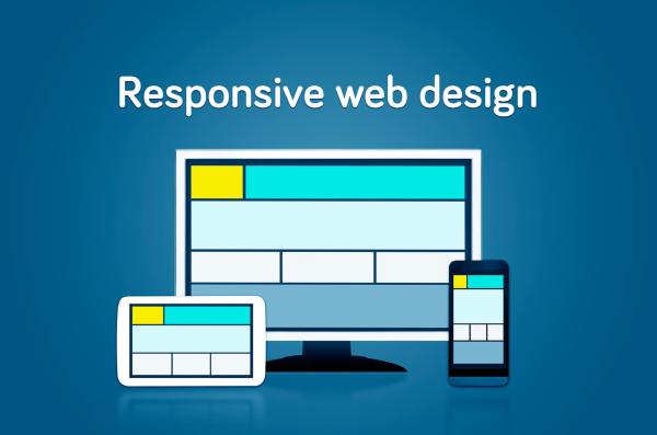
In today's digital age, mobile responsiveness is no longer a luxury but a necessity. With a significant portion of web traffic coming from mobile devices, ensuring your website is optimised for mobile users is crucial. This blog will delve into the intricacies of mobile responsiveness, focusing on optimising font size, forms, and overall mobile-friendly design.
Table of Contents
- Importance of Mobile Responsiveness
- Optimising Font Size for Mobile
- Designing Mobile-Friendly Forms
- Overall Mobile-Friendly Design
- Conclusion
Importance of Mobile Responsiveness
As of 2023, over 50% of global web traffic originates from mobile devices. This statistic alone underscores the importance of mobile responsiveness. A mobile-responsive website not only enhances user experience but also boosts your SEO rankings. Google has prioritised mobile-first indexing, meaning the mobile version of your site is considered the primary version.
“Mobile is not the future, it is the now. Meet your customers in the environment of their choice, not where it’s convenient for you.” - Cyndie Shaffstall
For more insights on how to improve your website's SEO, check out our blog on Search Engine Optimisation.

Optimising Font Size for Mobile
One of the most overlooked aspects of mobile design is font size. Text that looks perfect on a desktop can become unreadable on a smaller screen. Here are some best practices for optimising font size for mobile devices:
- Minimum Font Size: Ensure that the body text is at least 16 pixels. This size is generally considered readable without zooming in.
- Line Height: Set a line height of 1.5em to 1.75em to ensure text is easily scannable.
- Font Choices: Use legible fonts like Arial, Verdana, or Georgia. Avoid overly decorative fonts that can be hard to read.
- Responsive Typography: Use CSS media queries to adjust font sizes for different screen sizes. For instance, you can increase the font size for larger screens and decrease it for smaller ones.
Example:
@media (max-width: 600px) {body {
font-size: 14px;
}
}
@media (min-width: 601px) {
body {
font-size: 16px;
}
}
Designing Mobile-Friendly Forms
Forms are essential for capturing user information, but they can be a nightmare on mobile if not designed correctly. Here are some tips for designing mobile-friendly forms:
- Input Fields: Ensure input fields are large enough to be easily tapped. A minimum height of 44px (pixels) is recommended.
- Labels: Use floating labels or placeholders to keep the form clean and concise.
- Validation: Implement real-time validation to provide immediate feedback. This helps users correct errors without having to resubmit the form.
- Optimise for Touch: Use touch-friendly elements like dropdowns and sliders. Avoid using elements that require precision, like small checkboxes.
- Minimise Fields: Only ask for essential information. The shorter the form, the higher the completion rate.
For more tips on optimising your forms, read our blog on Customer Contact Form.

Overall Mobile-Friendly Design
Creating a mobile-friendly website goes beyond just fonts and forms. Here are some overarching principles to keep in mind:
- Responsive Design: Use a responsive design framework like Bootstrap or Foundation to ensure your site adapts to various screen sizes.
- Navigation: Simplify your navigation menu. Use a hamburger menu to save space and make it easier for users to find what they need.
- Images and Media: Optimise images for faster loading times. Use responsive images that adjust to different screen sizes.
- Performance: Speed is crucial for mobile users. Compress files, use a Content Delivery Network (CDN), and leverage browser caching to improve load times.
- Touch Gestures: Design with touch gestures in mind. Ensure buttons and links are large enough to be easily tapped.
Example:
@media (max-width: 600px){
    .navbar {
        display: none;
    }
    .hamburger-menu {
        display: block;
    }
}

@media (min-width: 601px) {
    .navbar {
        display: block;
    }
    .hamburger-menu {
        display: none;
    }
}
For more insights on impactful web design, check out our blog on Designing Impactful Websites.
Conclusion
Mobile responsiveness is a critical aspect of modern web design. By optimising font size, forms, and overall design, you can significantly enhance the user experience for mobile visitors. Remember, a mobile-friendly website not only improves user engagement but also boosts your SEO rankings. Stay ahead of the curve by continually testing and refining your mobile design strategies.
“In the world of Internet Customer Service, it’s important to remember your competitor is only one mouse click away.” - Doug Warner
For more tips on optimising your website, explore our blogs on Search Engine Optimisation and Tips to Optimise Conversion Rates.
By following these best practices, you can ensure your website is not just mobile-friendly but mobile-optimised, providing a seamless experience for all users.


