Website Navigation Standards: A Comprehensive Guide
Website navigation is a crucial aspect of user experience and Search Engine Optimisation (SEO). A well-structured navigation system can significantly enhance the usability of your site, improve your search engine rankings, and ultimately drive more conversions. In this comprehensive guide, we will explore various strategies to optimise your website navigation, ensuring a seamless and intuitive user experience.
Table of Contents
- Introduction to Website Navigation
- Simplicity is Key
- Consistent Layouts
- Descriptive Labels
- Use of Dropdown Menus
- Responsive Navigation for Mobile
- Prioritizing Important Links
- Breadcrumb Navigation
- Internal Linking Strategies
- Accessibility in Navigation
Introduction to Website Navigation
Website navigation is the roadmap that guides users through your site. It encompasses the menus, links, and organisational structure that enable visitors to find the information they need quickly and efficiently. An optimised navigation system not only enhances user experience but also plays a pivotal role in SEO, as search engines use navigation to understand the structure and relevance of your content.
For more insights on how to build a successful business website, you can check out our blog on Maximising Website Budget.

Simplicity is Key
One of the fundamental principles of effective website navigation is simplicity. Overcomplicating your navigation can confuse users and deter them from exploring your site further. Aim for a clean, straightforward design that highlights the most important sections of your site.
Consider the following example: A website with a cluttered navigation bar filled with numerous links can overwhelm users. Instead, opt for a minimalist approach, focusing on essential categories and subcategories. This not only improves user experience but also makes it easier for search engines to crawl and index your site.
Consistent Layouts
Consistency is key when it comes to website navigation. Ensure that your navigation layout remains uniform across all pages of your site. This creates a sense of familiarity for users, making it easier for them to navigate and find the information they need.
For example, if your main navigation menu is located at the top of your homepage, it should be in the same position on all other pages. This consistency helps users build a mental map of your site, reducing the learning curve and enhancing their overall experience.

Descriptive Labels
Using descriptive labels for your navigation links is essential for both user experience and SEO. Clear, concise labels help users understand what to expect when they click on a link, reducing confusion and frustration.
For instance, instead of using vague labels like "Services" or "Products," consider more specific labels such as "Web Design Services" or "E-commerce Solutions." This not only improves user experience but also provides search engines with valuable context about your content.
For more tips on optimising your website for conversions, check out our blog on Tips to Optimise Conversion Rates.
Use of Dropdown Menus
Dropdown menus can be an effective way to organise and display a large amount of content without overwhelming users. However, it's important to use them judiciously and ensure they are easy to navigate.
When implementing dropdown menus, follow these best practices:
- Use clear, descriptive labels for the main menu items.
- Limit the number of items in each dropdown to avoid clutter.
- Ensure the dropdown menus are accessible and functional on both desktop and mobile devices.
For a deeper dive into impactful website design, you can read our blog on Designing Impactful Websites.

Responsive Navigation for Mobile
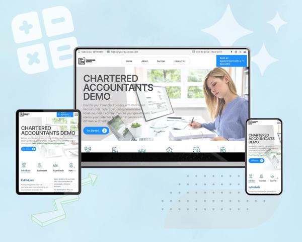
With the increasing use of mobile devices, it's crucial to ensure your website navigation is responsive and mobile-friendly. A responsive navigation system adapts to different screen sizes, providing a seamless experience for users on smartphones and tablets.

Consider implementing a mobile-friendly navigation menu, such as a hamburger menu or a collapsible menu, to optimise the user experience on smaller screens. This ensures that users can easily access and navigate your site, regardless of the device they're using.
Prioritizing Important Links
When designing your website navigation, it's important to prioritise the most important links. Place the most critical links, such as your main services or products, in prominent positions within your navigation menu.
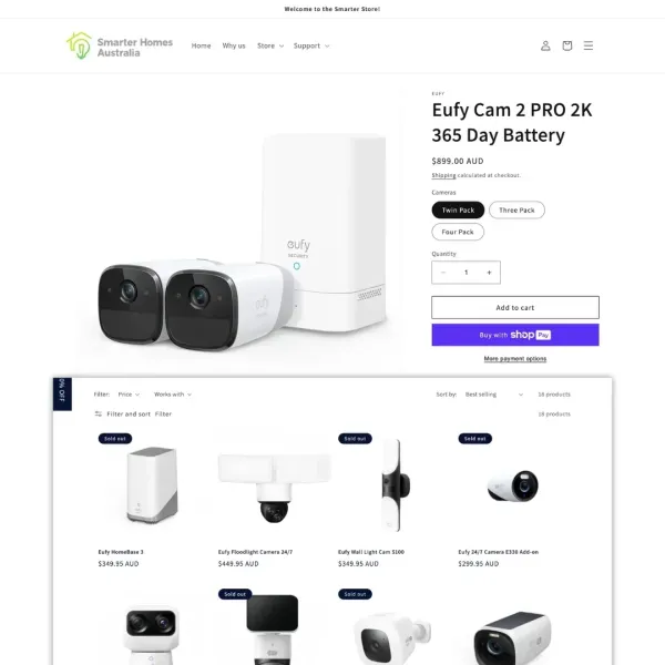
For example, if you run an e-commerce site, consider placing links to your top-selling product categories in the main navigation menu. This ensures that users can quickly find and access the most relevant content, improving their overall experience and increasing the likelihood of conversions.
Breadcrumb Navigation
Breadcrumb navigation is a secondary navigation system that helps users understand their location within your site hierarchy. It typically appears at the top of a page, displaying a trail of links that show the user's path from the homepage to the current page.
Implementing breadcrumb navigation can significantly improve user experience by providing clear context and making it easier for users to navigate back to previous pages. Additionally, breadcrumb navigation can enhance SEO by providing search engines with a clear structure of your site's content.
Internal Linking Strategies
Internal linking is a powerful strategy for improving both user experience and SEO. By strategically linking related content within your site, you can guide users to relevant information and keep them engaged for longer periods.
Consider the following internal linking strategies:
- Link to related blog posts or articles within your content.
- Use anchor text that clearly describes the linked content.
- Ensure that all internal links are functional and lead to relevant pages.
For more information on managing website details and optimising SEO, check out our blog on Manage Website Details.

Accessibility in Navigation
Ensuring that your website navigation is accessible to all users, including those with disabilities, is not only a best practice but also a legal requirement in many regions. Accessible navigation enhances user experience and broadens your audience reach.
Consider the following accessibility best practices:
- Use clear, descriptive labels for all navigation links.
- Ensure that your navigation menu is keyboard accessible.
- Provide alternative text for images and icons used in navigation.
For more insights on building an effective online presence, you can read our blog on Online Business Presence.
Conclusion
Optimising your website navigation is a critical component of enhancing user experience and improving SEO. By following the strategies outlined in this guide, you can create a seamless and intuitive navigation system that guides users through your site and helps them find the information they need quickly and efficiently.
Remember, simplicity, consistency, and accessibility are key principles to keep in mind when designing your website navigation. By prioritising important links, using descriptive labels, and implementing responsive and accessible navigation systems, you can create a user-friendly website that drives engagement and conversions.
For more tips and insights on website design and optimisation, be sure to explore our other blog posts, such as Search Engine Optimisation and iMac Design Advantage.


